I’m thrilled to share a behind-the-scenes look at the journey of Phantom Display’s recent rebrand. This transformation went far beyond a simple visual update—it was about pushing ourselves to elevate the experience for collectors who trust us to showcase their most prized pieces.
Every aspect of this process was carefully considered, from research and design to packaging and the unboxing experience. While the final product may appear seamless (and something we’re incredibly proud of), it represents countless thoughtful decisions and intentional effort behind the scenes.
I’m sharing this story to highlight the dedication that went into every step of the journey. A heartfelt thank-you goes to Collectibles & Media for giving us the platform to dive into the details and share what usually remains unseen.

Article Co-Author: Simon (Founder Of Phantom Display)
Starting with a clear vision
Hi everyone, Simon here, founder of Phantom Display.
The first step in our rebrand wasn’t about design—it was about going back to the basics and asking ourselves the big, foundational questions: Who are we as a company? What do we stand for? Why do we exist? What is our long-term vision? And how can we continue to push the boundaries? This journey wasn’t just about creating a fresh look; it was about realigning with our core purpose and setting the stage for where we want to be 5, 10, even 20 years from now.
Our mission is clear: to provide collectors with the highest-quality, thoughtfully designed displays that protect and beautifully showcase their most cherished items. Excellence drives everything we do, and we remain committed to delivering perfection—without cutting corners, ever.
This foundational work was crucial. It ensured that every decision we made later was anchored in a clear vision of who we are, how we want to serve our customers, and what we want to be known for. We also developed formal brand guideline documentation outlining fonts, colour pantones, design spacing, and more to help ensure we’re now able to stay more consistent visually wherever we show up.
Listening to what (who) matters most
With a clear brand strategy in place, our next vital step was immersing ourselves in understanding our customers and what they value most. For months, we conducted detailed surveys, analyzed market trends in the collectibles space, and listened intently to the feedback from those who use our displays every day. This in-depth research became the cornerstone of our rebrand, emphasizing the critical importance of designing with a deep understanding of who you’re creating for.
What we discovered was illuminating. Protection emerged as a top priority—collectors entrust Phantom Display with safeguarding their most valuable treasures. But beyond protection, we uncovered profound insights into what collectors truly seek in a display and, even more importantly, the deeper reason why they showcase their collections. It’s not just about presentation—it’s about storytelling, pride, and preserving what matters most.
While the final product may appear simple, it represents countless hours of research, feedback, and refinement. Every decision was purposefully made to reflect what resonates most with our customers.
We’re not trying to be everything to everyone. But for those who value thoughtful design and uncompromising quality, Phantom Display strives to be the obvious, trusted choice—always.
Crafting a truly premium unboxing experience
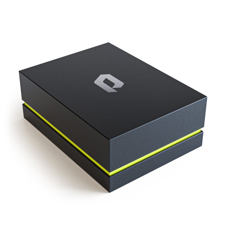
The packaging is often the first physical interaction collectors have with Phantom Display, and we wanted to make that moment truly feel special.
We went through countless rounds of testing, packaging prototypes and discussions around packaging materials, design, size, and structure. Every excruciating detail was considered—down to whether we should use single or double-sided custom colors for our packaging paper. The choice to go with double-sided colors for some products gave the packaging a richer, more immersive feel, but required a more complex production process. We felt it was worth it for the extra touch of luxury.
Beyond color, we also carefully considered elements such as susceptibility to finger marks and even the weight of the packaging itself. Should it be heavier to feel more substantial, or lighter while still feeling high-quality? Should we use magnets or go with a completely different lid design? How do we balance cost with production speed and carton complexity? After much testing, we struck a balance between premium feel and practicality. The internal design also needed to be perfect—how much spacing should there be inside around the display? What should the inner foam be made from to both securely hold the display while keeping it soft to the touch? Each element was chosen to make the unboxing feel protective yet luxurious.
Even the way the box opens was carefully designed to create a subtle suction effect. This is a well documented technique to subconsciously build anticipation as you open the packaging (think: iPhone). Does the lid open too quickly? How much tolerance should there be for the lid to effectively ‘grip’ the base of the box when someone is opening it? Our flagship “Ultra” line and more accessible “Nano” and “Premium” products each received distinct packaging designs that felt appropriate for their price point, all while retaining the premium feel Phantom Display is known for.
In the end we went through over a dozen different design iterations and countless hours of internal debates but needless to say, we’re very proud of the final results.


Mastering the art of disappearing
What seems like a simple logo update was, in reality, one of the most challenging aspects of our rebrand. We didn’t want a logo that simply sat on the surface of our displays—we needed something that integrated more seamlessly, becoming part of the display while at times disappearing altogether, while also reducing visual complexity.
The logo itself communicates more than just our name too. It’s designed to resemble both a “P” and a “D,” symbolizing Phantom Display, while creating a three-dimensional effect that mirrors the actual design of our displays.
Achieving this balance was no small feat. We ended up having to invest in a new laser-etching machine specifically to create the effect we wanted as the one our factory had couldn’t produce what we needed. We asked ourselves countless questions along the way: Where should it be placed? How close to the edges should it be? Is the size too big or too small? How deep should the engraving go into the acrylic? Should the logo be clear or frosted? The logo had to be present but not intrusive. We wanted the logo to be present enough that you recognised it and knew what it meant in terms of quality, while also doing a better job at fading into the background, to ensure that the card inside always took center stage.
Exclusive Behind The Scenes: Phantom Display
Helping collectors find the perfect display
Alongside the physical rebrand, we also overhauled our website to ensure the online experience was just as premium as our products. We wanted the site to be intuitive, easier to navigate, and helpful for collectors seeking the perfect display.
We streamlined the navigation so you can more quickly find exactly what you need. We wanted the website’s clean, minimalist aesthetic to mirror the look and feel of our products, creating a cohesive experience from browsing online to receiving the physical product.
Final thoughts: Sweat the details
At its core, this rebrand wasn’t about changing Phantom Display’s look for the sake of it. Every decision was made with purpose, ensuring each change added value to the overall experience—whether you’re browsing our website, unboxing a package, or proudly displaying your collection. We wanted every touchpoint to feel intentional and thoughtfully crafted, just like the collections our customers dedicate so much care to curating.
Along this journey, a few key themes stood out:
- Every detail matters. Even the smallest design choices—like the placement of a logo or the texture of a box—carry weight. These decisions may seem minor, but their impact is significant. We took the time to ensure each choice was deliberate, well-informed, and aligned with our vision.
- Branding is a story. It’s not just about a logo or a single element—it’s about how everything connects to tell a cohesive narrative. From the website to the packaging to the displays themselves, we worked to create a seamless experience that feels unified and meaningful.
- Stay rooted in your values. At every step, we asked ourselves: Does this reflect who we are? Does it align with what our customers value? This clarity served as our compass, guiding every aspect of the process.
As we look ahead, we’re more focused than ever on delivering world-class display solutions that not only protect but also celebrate the collections they showcase. We’re excited for what’s to come and remain deeply committed to honoring the passion and dedication of collectors everywhere.


Daniel, you are an absolute legend—no question about it. From the start, your focus on meaningful storytelling and attention to detail, combined with your genuine passion as a collector, was an incredible experience to witness. It’s a rare combination of traits that truly sets you apart.
Thank you for taking the time to listen, collaborate, and open up your platform to tell our story. It’s an honor to exclusively share this intimate look at our recent brand update on CollectiblesnMedia. Your patience and refusal to rush the process have resulted in an outcome that perfectly reflects the care and effort you poured into every detail.
Thank you, Daniel, for your hard work, creativity, and dedication.
Wow this is amazing!! I need one asap!
Holy smokes! Love the level of aesthetic added to the slab from these! All grails need to be stored in one ! 👌💯
These are so clean, I need some of these for my best cards !!
This truly is a brand that cares about your collection
Such a beautiful design, this would be great for displaying those rare cards. Truly amazing!
This is amazing!!